How to Design Eye-Catching Business Stickers That Get Results
- January 14, 2026
When customers see your business sticker in the wild—whether it's on a laptop, water bottle, storefront window, or company vehicle—you have mere seconds to make an impression. In today's saturated visual landscape, custom stickers have become powerful marketing tools that can build brand awareness, drive engagement, and create lasting connections with your audience. But not all stickers are created equal. The difference between a sticker that gets noticed and one that gets ignored often comes down to strategic design choices.
Understanding the Psychology of Visual Marketing
Before diving into specific design elements, it's essential to understand why stickers work as marketing tools. Stickers create a sense of ownership and personal expression. When someone chooses to display your sticker, they're essentially becoming a brand ambassador, integrating your message into their personal identity or space. This organic form of advertising carries more weight than traditional paid media because it comes with an implicit endorsement.
According to research from the Promotional Products Association International, promotional products like stickers have a cost-per-impression that's significantly lower than other advertising mediums, with recipients keeping promotional items for an average of eight months. The key to maximizing this longevity is creating a design that people genuinely want to display.
Start With Bold, Strategic Color Choices
Color psychology plays a crucial role in how your sticker is perceived and whether it catches the eye in a crowded visual environment. Different colors evoke distinct emotional responses and can significantly impact whether someone notices and remembers your sticker.
Bold colors naturally draw the eye, but the specific palette should align with your brand identity and messaging. High-contrast combinations like navy and yellow, black and white, or red and white create visual pop that makes stickers stand out. However, don't confuse "bold" with "chaotic"—successful sticker designs typically limit their palette to two to four colors to maintain visual coherence.
Consider your target audience's preferences and the contexts where your stickers will appear. If your stickers will primarily live on outdoor equipment or vehicles, vibrant colors that remain visible in various lighting conditions work best. For corporate environments or professional settings, more subdued palettes with strategic pops of color often perform better.
Test your color choices by viewing them in different contexts. A design that looks striking on your computer screen might blend into the background on a laptop lid or get lost against a colorful storefront window. Consider ordering sample stickers to evaluate how your colors translate to the final product.
Leverage Unique Shapes to Break Through Visual Clutter
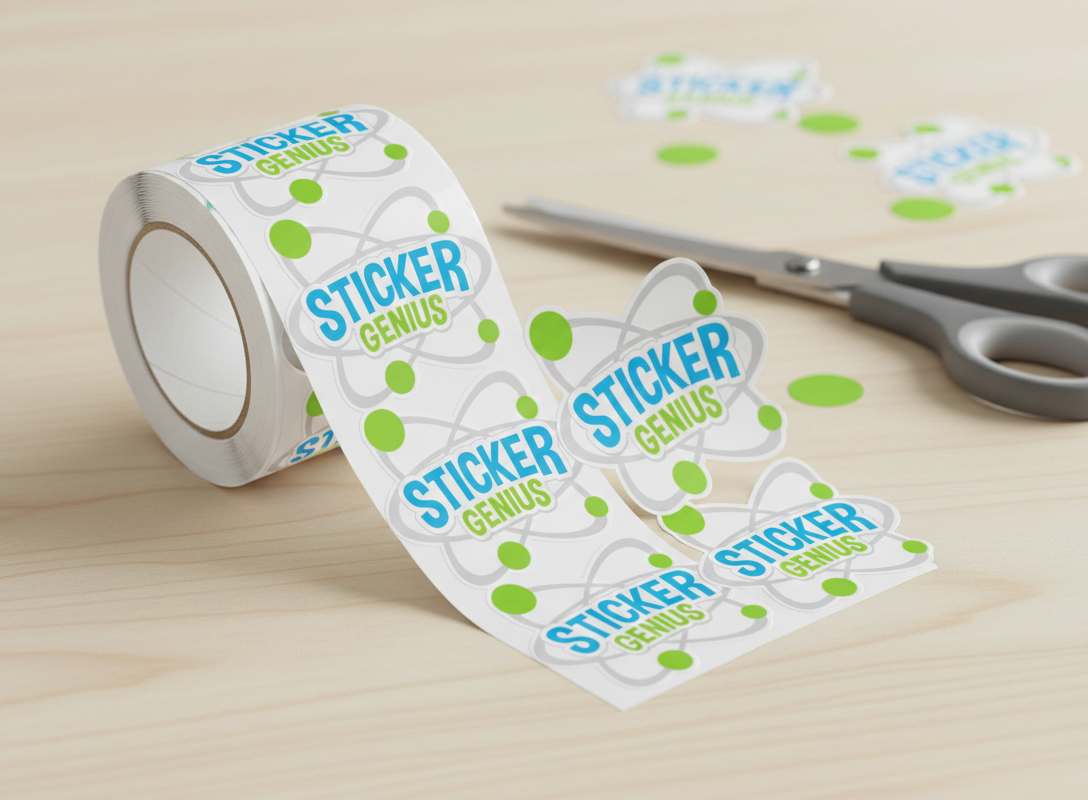
Most stickers follow predictable formats—circles, squares, rectangles. While these classic shapes work, custom die-cut shapes offer an immediate competitive advantage by breaking visual patterns and creating memorable silhouettes.
Your shape should reinforce your brand identity or product category. A coffee roaster might use a custom coffee cup shape. A tech company could use a circuit board pattern or device outline. A fitness brand might opt for a dumbbell or mountain silhouette. The shape itself becomes part of your branding, creating instant recognition even before someone reads your text or examines your graphics.
Die-cut stickers also allow you to eliminate unnecessary negative space, focusing attention on your core message or image. This can be particularly effective for logo stickers where the brand mark itself creates an interesting outline. The irregular edge also makes stickers feel more premium and thoughtfully designed compared to basic geometric shapes.
When designing custom shapes, maintain enough border and internal space to ensure structural integrity during production and application. Extremely thin sections or sharp points can be difficult to produce cleanly and may not adhere properly. Work with your printer to understand their capabilities and limitations for custom shapes.
Typography: Where Readability Meets Personality
Typography decisions can make or break your sticker design. Your font choices need to accomplish two seemingly contradictory goals: be instantly readable from a distance while conveying your brand's personality.
Start with readability. Your primary message should be legible from at least three to five feet away—the distance from which most people will encounter your sticker. This typically means choosing fonts with clear letterforms and adequate weight. Avoid overly ornate scripts or extremely thin typefaces for primary text, especially if your stickers will be viewed in motion or from various angles.
Font pairing creates visual hierarchy and interest. A common effective approach combines a bold, attention-grabbing display font for headlines with a cleaner, more readable font for supporting text. Limit yourself to two, maximum three, typefaces to maintain cohesion.
The size relationship between different text elements matters enormously. Your brand name or primary call-to-action should dominate, with supporting information significantly smaller. Many unsuccessful stickers try to cram too much text at similar sizes, creating visual noise rather than clear communication.
Consider letter spacing and line spacing carefully. Tight tracking can create a bold, modern look but reduces readability. Generous spacing feels more open and approachable but requires more real estate. Test your typography at the actual size your stickers will be produced—text that seems perfectly readable on your screen may become illegible at sticker scale.
Craft a Clear, Compelling Message
Even the most visually striking sticker fails if its message is unclear or unmemorable. Effective business stickers communicate one primary idea powerfully rather than trying to convey multiple messages simultaneously.
Your core message should answer at least one of these questions: What does your business do? What makes you different? What action do you want people to take? What feeling or value do you represent? The most successful stickers often focus on a single memorable statement, tagline, or visual metaphor rather than trying to explain everything about the business.
Keep text minimal. If your sticker requires more than seven to ten words to convey its message, you're probably overcomplicating things. Remember that stickers compete for attention with countless other visual stimuli. Brevity creates impact.
Consider including a call-to-action when appropriate, but make it subtle enough that the sticker doesn't feel like a hard sell. A website URL, social media handle, or QR code can provide a pathway for interested viewers to learn more without dominating the design. Place these elements strategically—typically smaller and toward the edge—so they're available for those seeking more information without overwhelming the primary visual message.
Balance Visual Elements for Maximum Impact
The arrangement of elements within your sticker design requires careful consideration of visual weight, white space, and focal points. Even with bold colors and striking typography, a cluttered layout dilutes impact.
Establish a clear focal point—usually your logo, primary image, or headline. Other elements should support this focal point rather than competing with it. Use size, contrast, and positioning to create a visual hierarchy that guides the viewer's eye through your design in the intended order.
White space (or negative space) isn't wasted space—it's a critical design element that gives your other components room to breathe. Adequate white space around text and images makes designs feel more professional and easier to process visually. Resist the temptation to fill every millimeter of your sticker with content.
Consider the rule of thirds: dividing your design area into a 3x3 grid and placing key elements along these lines or at their intersections creates naturally pleasing compositions. While not every sticker needs to follow this rule rigidly, it provides a useful framework for balanced layouts.
Make It Durable and Application-Friendly
Design decisions should account for the practical realities of how stickers will be used. A gorgeous design that fades quickly, peels at the edges, or proves difficult to apply won't deliver long-term marketing value.
Consider the material and finish that will best serve your sticker's intended use. Weather-resistant materials work for outdoor applications. Removable adhesives make sense for temporary campaigns or applications where damage to surfaces is a concern. Laminate coatings protect against fading and scratching, ensuring your vibrant colors and crisp details survive real-world use.
Think about application surfaces. Designs with complex contours may be difficult to apply smoothly to curved surfaces. Very large stickers require more expertise to apply without bubbles or wrinkles. For stickers intended for amateur application, simpler shapes and moderate sizes increase the likelihood they'll be applied successfully and displayed proudly.
Test, Iterate, and Improve
Even experienced designers benefit from testing sticker designs before committing to large production runs. Order small quantities or samples to evaluate how your design translates to the actual product. Place these test stickers in the contexts where you expect them to appear—on vehicles, windows, laptops, or wherever your target placements are.
Gather feedback from people who represent your target audience, but also from people outside that group. Sometimes fresh eyes catch issues that you've become blind to through familiarity with the design. Pay particular attention to feedback about readability, memorability, and emotional response.
Be prepared to iterate. The first design rarely hits every mark perfectly. Small adjustments to color saturation, font sizes, or element positioning can dramatically improve effectiveness. Professional designers often go through multiple rounds of refinement before finalizing a design for production.
Creating Stickers That Work as Hard as Your Business
Exceptional business stickers combine artistic vision with strategic thinking. They grab attention through bold colors and unexpected shapes while communicating clear messages through thoughtful typography and composition. They're durable enough to last, appealing enough to display proudly, and memorable enough to create lasting brand impressions.
When you invest time and thought into designing stickers that truly resonate with your audience, you create miniature brand ambassadors that spread your message organically. In a world where traditional advertising often feels intrusive, well-designed stickers offer a welcome form of marketing that people actually want to engage with and share.
Free Shipping
All U.S. orders over $99 receive free shipping (Excluding Hawaii and Alaska). Expedited shipping options available.
No Minimum
Yes, that's correct. We will print any size order you need. Order quantity 1 or 1,000,000
Fast Turnaround
Standard turn around ships within a week. Request rush production for faster turnaround.
Made in the USA
All stickers proudly produced in The Genius Lab by our "Stickologist" just north of Detroit.
